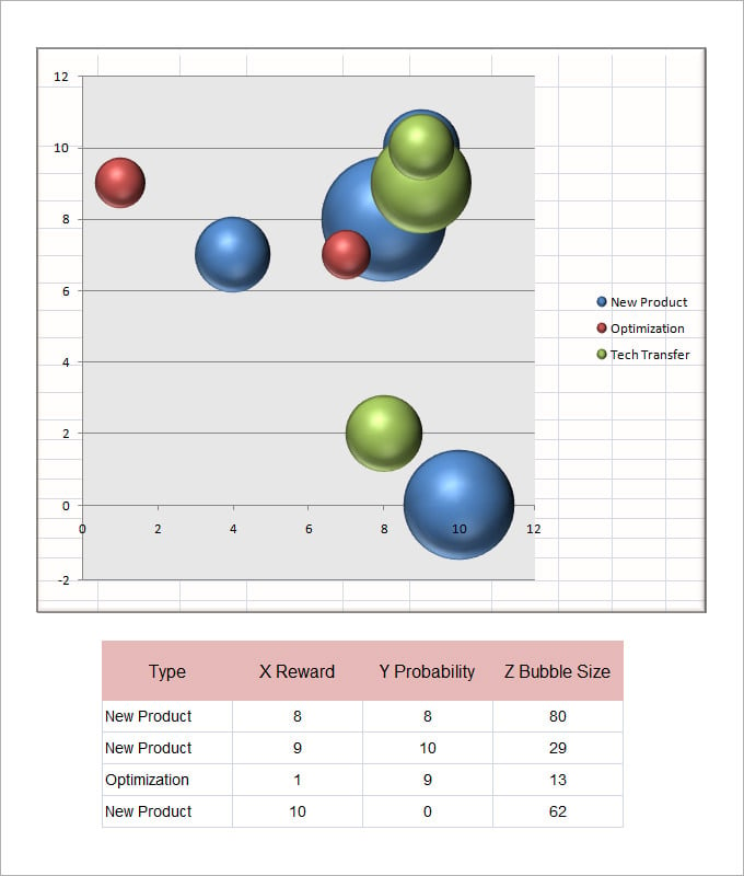
A bubble chart is a type of data visualization that uses circles, or bubbles, to represent data points. Each bubble in the chart represents a specific data point, and its size is proportional to a third variable. The x and y axes of the chart represent two different variables, while the size of the bubbles represents a third variable. This type of chart is often used to display and compare data in a visually appealing and easy-to-understand way.
How Does a Bubble Chart Work?
To create a bubble chart, you need three sets of data: one for the x-axis, one for the y-axis, and one for the size of the bubbles. The x and y axes represent two different numerical variables, such as time and cost, temperature and humidity, or age and income. The size of the bubbles represents a third numerical variable, such as population, revenue, or sales.
Each data point is plotted on the chart using its x and y values, and the size of the bubble is determined by the third variable. The larger the bubble, the higher the value of the third variable. This allows for easy visual comparison of data points and identification of patterns or trends.
For example, let’s say you want to visualize the population, GDP per capita, and life expectancy of different countries. You would plot the population on the x-axis, the GDP per capita on the y-axis, and the size of the bubbles would represent life expectancy. This would allow you to see how population and GDP per capita relate to life expectancy across different countries.
Why Use a Bubble Chart?
Bubble charts are a powerful tool for data visualization because they can convey multiple dimensions of data in a single chart. They allow you to compare the relationship between two variables, while also showing the magnitude of a third variable. This can help identify correlations, outliers, and trends that may not be apparent in other types of charts.
Additionally, bubble charts are visually engaging and easy to understand. The use of bubbles instead of traditional data points or bars adds a level of visual interest and makes the chart more appealing to the reader. The size of the bubbles also provides a clear indication of the relative magnitude of the third variable, making it easier to interpret and compare the data.
When to Use a Bubble Chart?
Bubble charts are most effective when you have three numerical variables that you want to visualize and compare. They are particularly useful when you want to show the relationship between two variables and how they are affected by a third variable.
Some common use cases for bubble charts include:
- Market Analysis: Use a bubble chart to compare market share, revenue, and customer satisfaction across different industries.
- Product Development: Visualize the cost, time, and customer demand for different product features to prioritize development efforts.
- Financial Analysis: Analyze the relationship between stock price, earnings per share, and market capitalization for different companies.
- Social Science Research: Explore the relationship between income, education level, and health outcomes across different demographic groups.
- Project Management: Track the progress, budget, and resources allocated to different project tasks to identify bottlenecks or areas of improvement.
- Geographic Data: Display the population, GDP, and life expectancy of different countries on a world map using a bubble chart.
- Marketing Analysis: Compare the reach, engagement, and conversion rates of different marketing campaigns or channels.
- Economic Analysis: Visualize the relationship between inflation, unemployment, and GDP growth for different countries or regions.
How to Create a Bubble Chart?
Creating a bubble chart is relatively straightforward, especially if you are using data visualization software or tools. Here are the general steps to follow:
- Collect your data: Gather the data you want to visualize and ensure you have three numerical variables.
- Choose a tool: Select a data visualization tool or software that supports bubble charts. Some popular options include Tableau, Excel, Google Sheets, and Python libraries like Matplotlib or Plotly.
- Input your data: Enter your data into the software or tool, ensuring that each variable is assigned to the correct axis or size parameter.
- Create the chart: Use the software’s chart creation tools to generate a bubble chart. Specify the x-axis, y-axis, and size parameters, as well as any additional customization options.
- Customize the chart: Adjust the appearance of the chart to match your preferences or the requirements of your audience. This may include changing colors, labels, titles, or legends.
- Analyze and interpret: Once your chart is created, take the time to analyze and interpret the data. Look for patterns, trends, or outliers that can provide insights into your data.


Example: Bubble Chart for Sales Analysis
Let’s say you work for a retail company and want to analyze the relationship between advertising spend, website traffic, and sales for different products. You collect the following data:
- Product A: Advertising spend: $10,000, Website traffic: 5,000 visitors, Sales: $50,000
- Product B: Advertising spend: $8,000, Website traffic: 4,000 visitors, Sales: $40,000
- Product C: Advertising spend: $12,000, Website traffic: 6,000 visitors, Sales: $60,000
- Product D: Advertising spend: $6,000, Website traffic: 3,000 visitors, Sales: $30,000
You input this data into your data visualization software and create a bubble chart. The x-axis represents advertising spend, the y-axis represents website traffic, and the size of the bubbles represents sales. The resulting chart allows you to easily compare the relationship between advertising spend, website traffic, and sales for each product. You can see that Product C has the highest sales, followed by Product A, Product B, and Product D. This analysis can help you make informed decisions about where to allocate your advertising budget and which products to focus on.
Conclusion
Bubble charts are a powerful tool for visualizing and comparing data. They allow you to represent three numerical variables in a single chart, providing insights into relationships, trends, and patterns that may not be apparent in other types of charts. By following the steps outlined in this article, you can create your bubble chart and gain valuable insights from your data.
Bubble Chart Template Excel – Download